That unpleasant moment we’ve all experienced at one point or another: you’re standing in front of your closet in the morning and you have no idea what to wear. By the time you finally put together an outfit, you’re running late – not the best start to your day…
That’s right, knowing how to buy the right clothes isn’t enough. Knowing how to combine basics and bolder pieces, making sure the colors harmonize with one another, is also essential to your style.
So, today, a quick review of colors. We’ve already had the opportunity to explain to you which colors to wear and how to coordinate them in an outfit.
However, reading the survey which you answered last week, it’s obvious that colors is still a confusing topic for many of you.
We’re therefore going to quickly go over the basics again. Then I’m going to talk to you about something totally new: repeating colors and materials.
The basic rules
First and foremost, don’t go overboard with color. The idea isn’t to look like a clown. Covering yourself in bright colors that don’t work together just because you’re bored of your basic pieces – which are well-chosen, but a bit too plain worn on their own – isn’t going to get you anywhere.
If you discovered this blog over the last six months…
Play it safe for now, and focus on wearing high-quality basic pieces in the right size and cut for you. Don’t try to be too original straight away.
- Choose two or three colors to dominate your outfit, and no more (try blue, gray, brown, beige or khaki).
- Aim for balance and harmony: bold colors should be toned down by more subdued colors like gray and navy blue.
- Play with repeating colors and materials to give structure and unity to your outfit (we’ll look at how to go about this later in this post).
Simple and fuss-free: good enough for a beginner.
You can create original looks using classic colors.
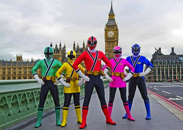
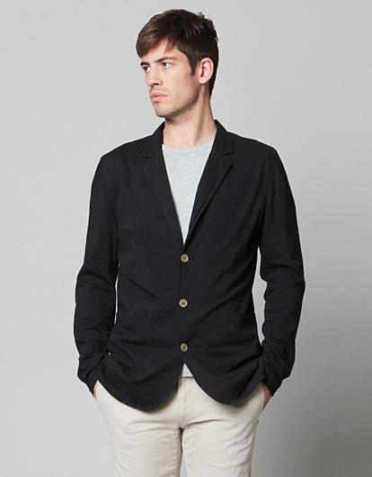
I’m going to do everything I can to stop you from looking like this.
If you’ve been reading this blog for a long time…
You’ve no doubt already acquired a lot of the basic pieces that we’ve recommended to you. Your old shirts, which were too big on you, and your jeans, which weren’t tight enough, are probably starting to be replaced by high-quality items in the right size.
And maybe you’ve started adding bolder pieces to your wardrobe (a leather jacket, cowboy boots, clear blue trousers, etc.), or basic pieces that are, well, a bit less basic (a t-shirt with a more elaborate collar, a blazer made from a more original fabric, a coat with leather yoke, etc.).
Unfortunately, it’s often at this point that you start to stagnate and your progress starts to slow down. You’d like to give more original looks a try, but you don’t really know where to begin, and you’re worried your ensembles will look chaotic. You’re even more reticent given that you’ve just started receiving sincere compliments from your family and friends – no one wants to take a step backwards.
The two comments I hear over and over again are:
- I don’t know how to incorporate more original colors and materials into my outfits; and
- I don’t know how to integrate bolder pieces into outfits put together from my basic pieces.
In both cases, a mastery of colors is the solution. So, let’s go!
An example of a well-executed outfit that’s a bit too simple.
Incorporating original colors and fabrics
For girls, it’s almost instinctive. They manage to coordinate colors perfectly, repeating the same color in different areas of their outfit. And the result is (almost) always clear-cut: a unified appearance. Yeah, girls were sharpening their sense of style by reflecting on their outfits while we were making holes in our trousers during recess…
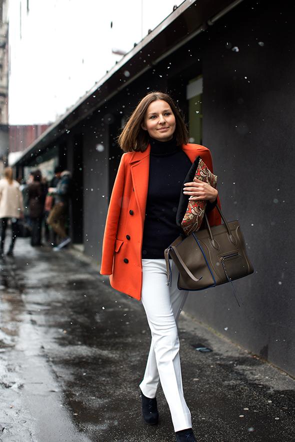
A harmonious ensemble, despite being made up of quite bold pieces (an electric orange coat, white trousers, multi-colored accessories). The magic happens thanks to the fact that the clutch bag brings together colors from the rest of the outfit. Plus the natural but carefully chosen make-up that this woman is wearing. And the fact that the shoes are plain black, echoing the color of the sweater and meaning that the outfit doesn’t look “too much”. The brown bag provides an alternative to black and white, goes well with the orange coat, and matches the color of the woman’s hair. Bam! 1-0 from the midfield!
You’ve realized by now that we’re running a bit behind. But don’t panic. One day, the student will surpass the master 😉
Getting colors right as a man : Example 1
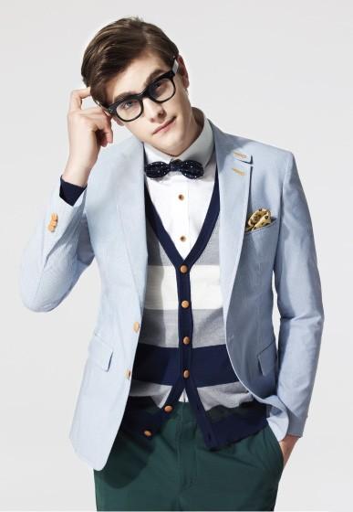
Here’s an example of an attractive combination of colors:
The outfit is balanced, based on three complementary colors: blue, pine green, and white. The outfit is fleshed out with:
- a bolder color, yellow, which appears in small touches throughout the outfit: on the buttons, the buttonholes of the blazer, and the pocket square;
- a cardigan that brings together the white of the shirt, and the blue of the blazer and bow tie in one piece; and
- original fabrics: the poplin of the shirt, the thick cotton of the blazer and trousers, and the knit of the cardigan.
To summarize, the outfit is:
- balanced, because it’s based on a few classic colors
- fleshed out by a bolder color and original fabrics; and
- unified, because the touches of bold color and original fabrics are discreet and appear throughout the outfit.
It’s meeting this criteria that allows you put together an attractive, cohesive outfit.
Of course, this look is an extreme example. You don’t need to (and shouldn’t) match up and proportion the colors in your outfit with surgical precision! A look that’s too “matchy” will give off the impression that you spent an hour locked in your bathroom putting it together.
Color coordinating might seem like a complicated procedure at first, but, with practice, it will become intuitive. Remember: the aim is to use coordination and repetition of colors as a tool to give cohesion to your outfit – it should certainly not be taken as an end in itself!
Getting colors right as a man : Example 2
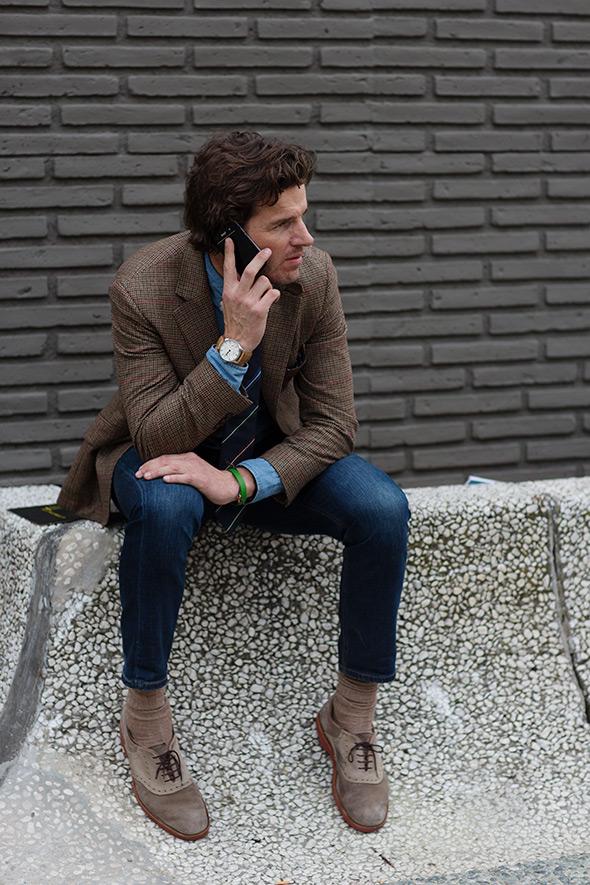
Let’s take a look at a more simple example: a shirt, a blazer, a pair of jeans, and shoes.
We’ll put the tie, the watch and the bracelet to one side.
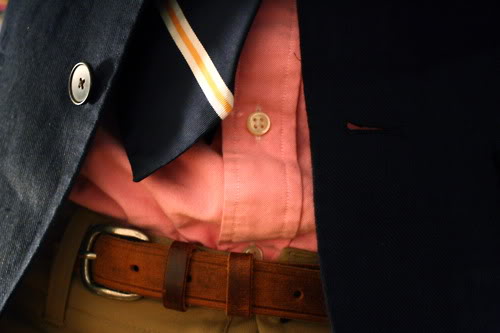
The combination of raw jeans and a denim shirt doesn’t look “too much”, even though the color blue is dominating the outfit, because the items are in different shades, and their fabrics are similar but not identical. They echo each other without copying each other.
The country-style tweed blazer brings a bolder color (little red stripes) into the mix: the outfit is fleshed-out. The shoes echo the blazer, again, without being an identical color match.
What also helps to flesh out the outfit is the variety of fabrics used: leather, knit, jeans, chambray, tweed… The same outfit in solely smooth cotton definitely wouldn’t have the same impact.
Note also that if the guy in this photo had been obsessed with repeating the colors in his outfit in exactly the same shade each time, this look would have lost its natural, simple vibe. So, one last time: repeated colors should be similar, but not necessarily identical, and on varying materials. (In other words: break out of your buying habits a little bit, diversify your wardrobe, and have fun!)
A quick remark on the green bracelet, which, in theory, has nothing to do with the rest of the outfit: it’s effectively there to shake up the orderliness of the outfit. It’s kind of the little detail that says, “I didn’t spend half an hour putting this outfit together this morning, by the way. The proof? I’ve got this green thing hanging off my wrist that I don’t really care about.”
In my outfit, the shirt brings together the classic colors of the rest of the outfit… but the pieces are all made of different materials.
Don’t forget that you don’t just have to stick to repeating colors. You can also play with repeating materials to pull your outfit together.
How to integrate those infamous bold pieces into your outfits
Once you’ve mastered the technique of echoing colors and materials, you can start to introduce bolder pieces into your look.
You may have recently bought a bold piece that you loved in the store but don’t know what to do with in real life. In order not to come off as a “fashion slave”, you simply need to integrate it by picking up on its colors and materials elsewhere in your outfit. Again, it’s all about creating balanced ensemble that’s easy on the eye.
To achieve that, imagine that the bold piece (which will inevitably be rich in colors or materials) is linked to the other items in your outfit.
Wear basic pieces that echo some of the colors of the bold piece…
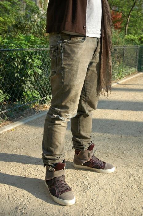
These Lanvin sneakers are integrated into the rest of the outfit thanks to the color of the jeans and cardigan.
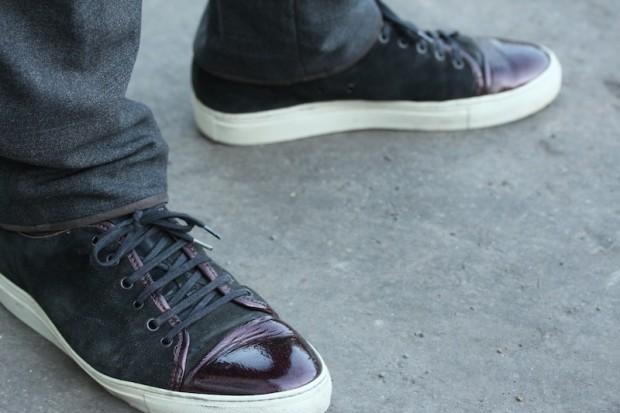
… and some of the materials…
Here, it’s the leather of the laces that is echoed elsewhere in the outfit.
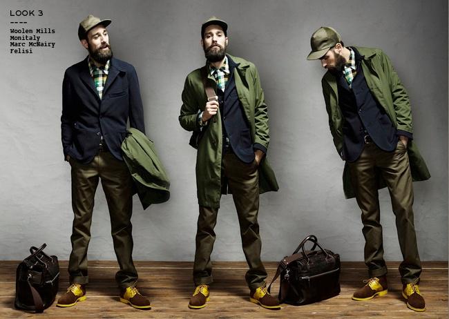
… and, if the bold piece is in just one color and material, echo that color and material in your accessories, too.
Almost no basics, but well-chosen repetitions, especially in the accessories, adding unity to the outfit.
Other tips:
- When you wear a bold piece, streamline the rest of your outfit as much as possible so that it doesn’t look “too much”.
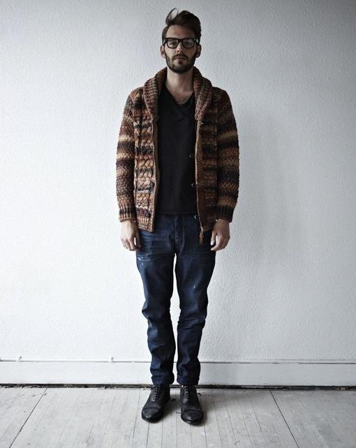
Here, an understated outfit is the canvas for a big, colorful sweater.
- Use neutral colors like gray beige or navy blue to subdue any bolder colors present on the bold piece.
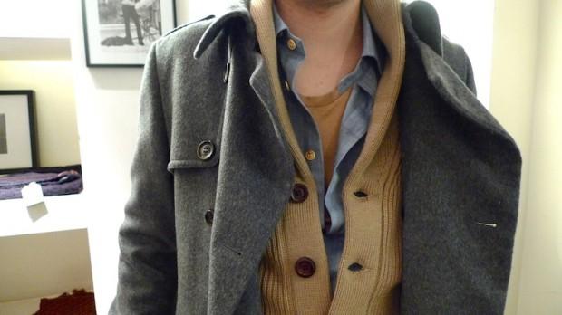
Numerous different fabrics; a few understated colors. The rest takes care of itself!
I hope this post has shed some light on the sometimes obscure topic of wearing colors. My next post will be about how put together an outfit.
As usual, feel free to leave us questions in the comments section below, and I’ll get back to you.

As usual, feel free to leave us questions in the comments section below, and I’ll get back to you.
For guys that have a dark complexion similar to artist 50 cent, do you recommend they wear dark or light colors. One person told me light colors to create contrast with the skin, while another person said darker colors like burgundy and to stay away from light and bright colors like yellow, orange and light blue.
I’m a bit conflicted but the 2nd person said wearing bright colors makes me look darker. Like how white on a black background really brings out the black
Just wanted to thank you for the good article. I am glad you guys are doing this for us.
Thanks for the article. I really enjoyed it!
I have dirty blonde hair with dark blue-grayish eye and a fair skin complexion. How can I identify which color fabrics fit me better?
for some reason, I’m obsessed with the burgundy/wine/darkred/maroon color.
it looks good as single pieces in the outfit by fit and it being a nice looking color on me, but I’ve been having trouble coordinating it with outfits. I can really only get navy or some other shades of blue to work with it. but regardless, my burgundy chinos are some of my favorite pieces in my wardrobe.
Thanks a lot for your kind words 🙂
Thanks Mike
Hi Joe, as I understand it you’ve got a low contrast complexion. You should try to repeat this contrast in your outfits. Have a look there: http://www.kinowear.com/how-to-wear-colors-2
Hi Adale, it’s not all black or white. I wouldn’t say you should wear only dark or bright colors. My best advice would be to be aware of contrasts as explained in this post: http://www.kinowear.com/how-to-wear-colors-2
The picture below is eloquent. You to reach an outfit like the one on the left that brings light toward your face. Which is more easily obtained with light colors and low contrasts.
http://www.kinowear.com/wp-content/uploads/2013/10/Screen-Shot-2012-12-24-at-11.50.44.png
Hi Chris,
Actually these kind of earthy tones aren’t hard to put in an outfit. Grey, Beige,White are simple enough colors that you can wear it together without even thinking about it.
Brown, Navy (and hues of blue) will bring more life to the outfit and you’ll be set.
Light leather for your belt, or dark purple for your scarf will work nice too. (what I’m wearing today!)
Nicolas.
I’m wearing deep orange corduroys from UNIQLO and subdued them with a T-shirt, shirt and blazer in dark blue/indigo/charcoal hues. Heading off to see friends now and can’t wait for them to tell me to go home and change my trousers 😛 then I will show them the bright orange socks I’m wearing!
Hi Jasdev_Sekhon
😀 That’s really bold! I’m totally ok with the orange corduroys but the matching socks seems really too much! Anyways, it seems like you know what you’re doing and if you’re having fun it’s perfect.
Hi Jas,
Thanks a lot for your comment.
Sounds like a great outfit!
These sneakers look cool too. Don’t worry about the color, of course white catches a lot of light and drag the eye but no need to worry it matches well with any other color.
My advice would be to go with an almost straight cut pair of jeans or straight beige/gray chinos. You don’t want a slim cut because the sneakers will appear too big. That’s pretty much the only thing to worry about.
Is that helpful ?
Hey Nicolas,
First of all I want to congratulate you for the awesome work you have been doing in this blog, you´ve posted really great articles over here with pratical advices and I´m pretty sure that the Knoledge I got from Kinowear I wouldn´t be able to get from all others blogs I Know, I am really greatfull for that.
What is your opinion about casual checked shirts?
Hey Rodrigo, thanks for all your praise 😀
I really like checked shirts but not all of them. In my opinion a nice checked shirts has two colors in it, not more and these colors are the usual colors that work well in a men’s closet.
I’m talking about, white/navy checks, white/grey checks, white/light blue checks. And keep the checks small and simple (no need for dozens of lines crossing each other) it looks better that way.
This looks good for instance : http://31.media.tumblr.com/ea2bd8dbebdb1c4fd1701c33b07d632d/tumblr_muds9oHWNe1sfedbqo1_500.jpg